
What the focus
Focus management is a key aspects of making any UI accessible. When properly implemented it makes navigating the website seamless for everyone.
Focus management checklist
1. Visible focus indicator
Focus indicator should always be visible and must have enough contrast with the background as well as with the element itself. Most major browsers come with default styles for focus indicators and these work well for the most part. In scenarios where these indicators don’t work with your design system or the brand colors, we would want to override the default focus indicators. This can be done using the css outline property as below. This works on light backgrounds but quickly fails on darker backgrounds as shown in below screenshots.
*:focus {
    outline: 2px solid brown;
}


One common strategy to work around this is to use double layered focus indicators with both a light color and a dark color. This ensures it works on most backgrounds. This can be achieved by using box-shadow as the second layer along with outline.
*:focus {
  outline: 2px solid brown;
  box-shadow: 0 0 0 4px white;
}


2. Focus order
This is the order in which the focus moves from one interactive element to the next when a user presses the tab key. The default order for this is the order in which elements appear in the HTML document. This order is great for web pages where all the interactive elements follow the normal flow of the document. It is better to maintain normal flow and never deviate from it.
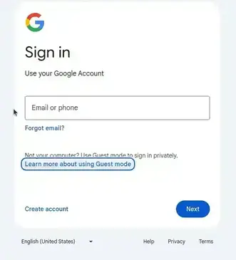
In certain cases we may want to deviate from the visual order, in that cases it is better to achieve it with layouts than to use alter the tabindex. In fact, is recommended not to use a positive tabindex at all. For example, Google SignIn page has two buttons “Create account” and “Next”, even though “Create account” appears to be first in the reading order, it is the secondary action. So, “Next” button, being the primary action, receives the focus first and then it moves to “Create account”. Here, it is achieved not by altering the tabindex instead “Next” button is placed before “Create account” button in DOM and then visually reversed using flex-direction: row-reverse, thus preserving the normal flow.
3. Never lose focus
Losing focus is when a focus indicator is no longer visible on a page. This usually happens in two scenarios.
- A hidden element is focussed
- An element with current focus is removed from the DOM
Focus moves to a hidden element
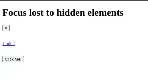
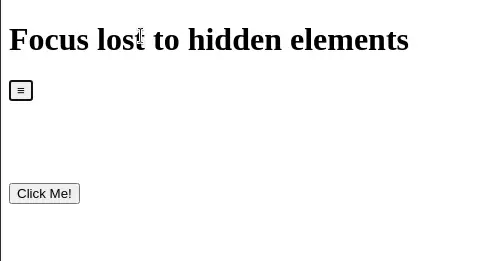
Users get disoriented if focus is moved to an hidden element while navigating with tab key, because the focus indicator is no longer visible. A good example of hidden focusable element is the site navigation which turns to a hamburger menu on small screens. When collapsed, only the hamburger menu button should take focus and skip all items but when expanded menu items also should take focus. This is usually taken care when display: none or visibility: hidden is used to hide the menu items. If any other method is used to hide such items, explicit care must be taken to handle it.
Focused element is removed
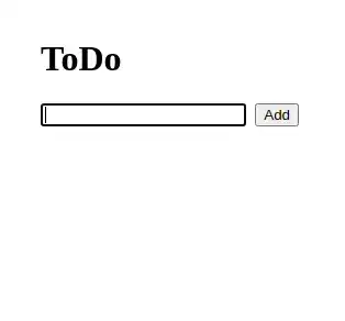
When an element with focus is removed, the focus should ideally move to next focusable element or an element which makes sense for the given situation. Browsers by default move the focus to body which makes the focus ring disappear. This can be common use case when we are removing items from a list with delete button.

4. Grab, trap and return focus
In the context of a modal/dialog, when it opens, it should grab the focus and place it on the first focusable element in it. And when it closes, it should return it to the element which was active when the modal opened. While the modal is open, the focus should be trapped in it meaning it should cycle through the interactive elements within the modal but never leave the modal. Also, rest of the page should be rendered inert.
While focus grabbing, returning and making the rest of the page inert can be easily achieved with the new HTML dialog element. In cases where there are custom dialog implementations, we should ensure this behavior is implemented with javascript. However we must implement focus trap behavior using Javascript in either case. Please find the sample implementation using dialog element and behavior in the embedded pen below.
See the Pen Codepen that demonstrates the right focus behavior of modal dialog by (@vinod-krishna-vellampalli) on CodePen.
6. Don’t steal focus
Focus stealing is simply moving focus without user action/intent. It is bad from the user experience perspective as it is not just disorienting but also interrupting the user from the current task he is doing. It may also become security concern in few cases, like when something sensitive is being typed into a masked field and the focus abruptly moves to a different field revealing the sensitive information.
Usually these kind of behaviors are implemented to grab user’s attention. There are alternative, less interruptive, ways of requesting user’s attention. For example a distinct notification dot can appear which will notify the user of a background event like a new message in a inbox. Another approach is to add motion like pulsation to the element that needs attention.
Thank you for reading thus far. If you find this article helpful and think any one you know may get benefitted by this, please feel free to share it.
--Vinod Krishna Vellampalli